Our clients change lives. We change the way they use tech.

Featured projects


“The Firefly team is incredible! They take time to understand your needs and help you bring your vision to life. Firefly helped to transform the way our organization communicates and serves our community and for that we are so very grateful.”


“Working with Firefly on our membership portal and analytics dashboard has been a gamechanger for OIA. Their work has provided us with actionable insights into our members’ needs and behaviors, allowing us to craft more targeted outreach strategies. Firefly has made it possible for OIA to deliver targeted, timely, and meaningful engagement opportunities for our membership, strengthening our overall value to the outdoor industry.”

For nearly five years, our partnership with Firefly has been invaluable. Leading the redesign of our KIND website, they’ve consistently served as our trusted digital ally, strategically enhancing and optimizing our online presence. Firefly has always understood and remained committed to our mission of safeguarding the children we serve.
All projects

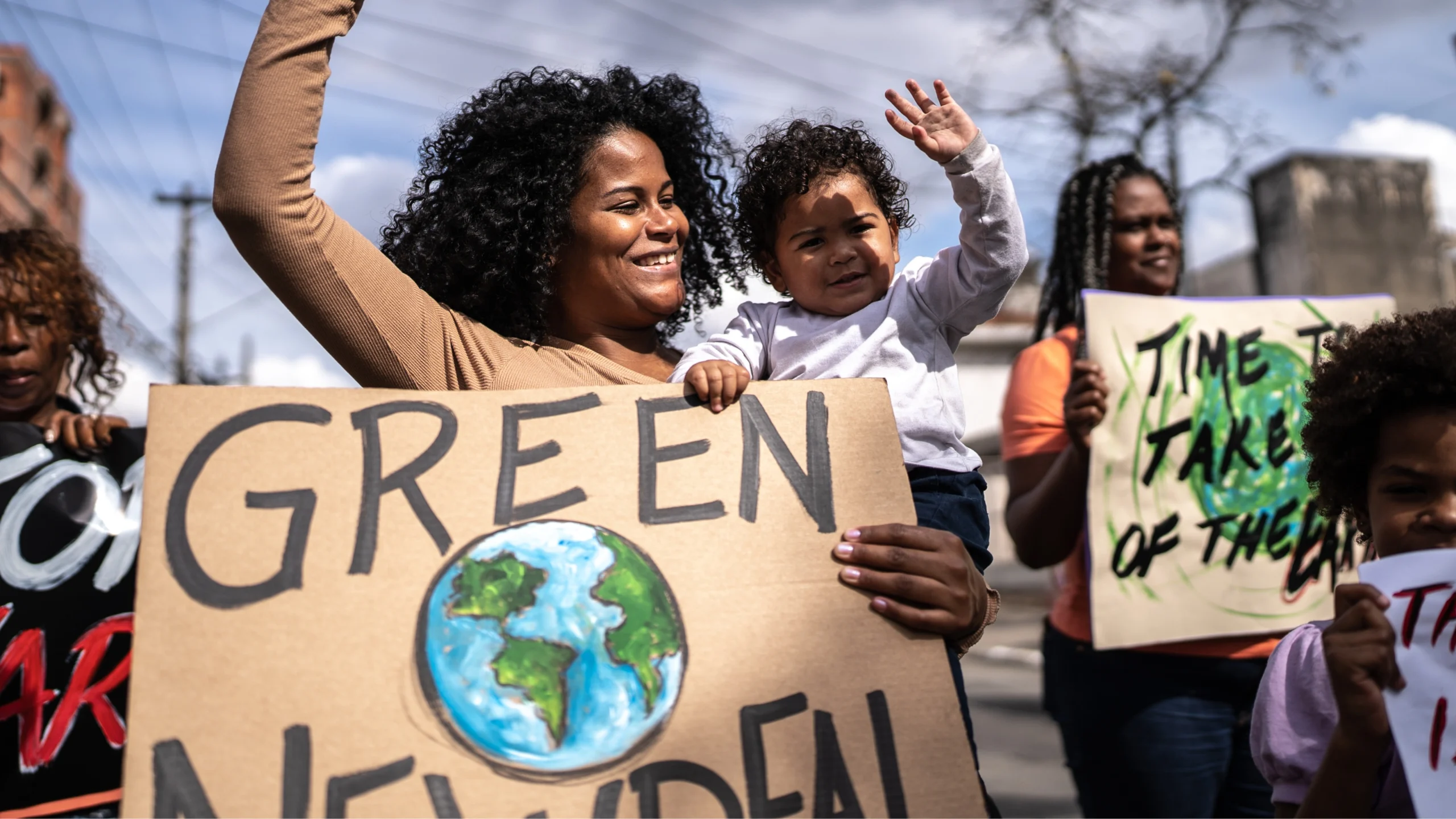
Revitalizing Community Engagement Through a MarTech Overhaul

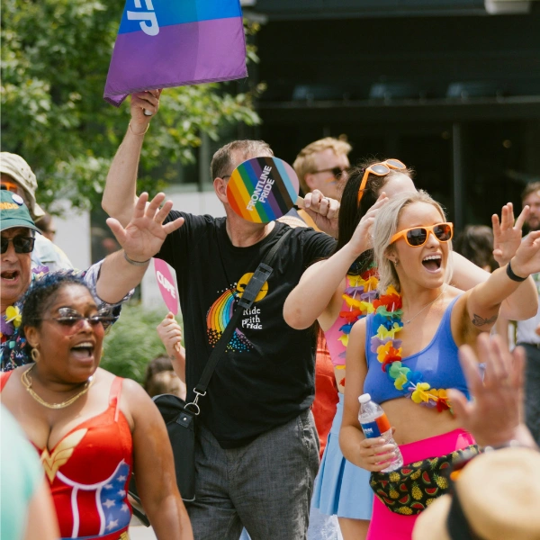
Redefining digital spaces for LGBTQ+ inclusion

A digital revolution for a legacy organization

Powering lymphoma research with a new email strategy

Reaching arthritis warriors, one email at a time

We typically begin with an audit of your organization’s “digital ecosystem”–the tools, customer engagement platforms, and marketing channels you’re using daily. We also get to know your audience–that’s anyone your organization needs to reach, including donors, customers, and clients.
- Audience research
- Competitor analysis
- Multi-channel personalization
We make sure your tech platforms and digital strategies align with your mission and audience IRL. That means optimizing your website and creating smoother processes for data management, donor relations, and customer engagement.
- Tool migration planning
- Platform optimization
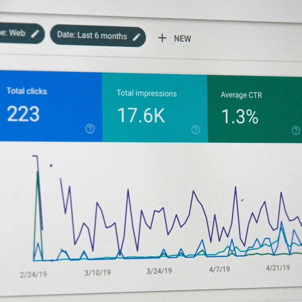
- Analytics & Dashboards
Based on what we’ve learned about your audience, data, and tech stack, we bring it all together to build and implement customized digital marketing strategies that extend your reach and amplify your mission.
- Automation strategy
- Content strategy
- Email & Website Optimizations
Thanks! You’ll hear back within 48 business hours
In the meantime, why not check out our latest case study?


Whether you need help with a project, want to learn more about us, or just want to say hi, you’ve come to the right place.